Both Android L and iOS 8 have been hot topics of late. Both developer previews have provided us with plenty to look forward to – third-party keyboards and sharing options in iOS, a new design language in Android L, built-in health and fitness features for both, and major improvements all around.
Yesterday, we compared the Android L and iOS 8 developer previews, and while we understand these still are not completely finished versions of software, there are some things we’d like to change about each OS. There are things Google could learn from Apple and vice versa.
Below, you will find five iOS features Android could stand to adopt.
Family Share
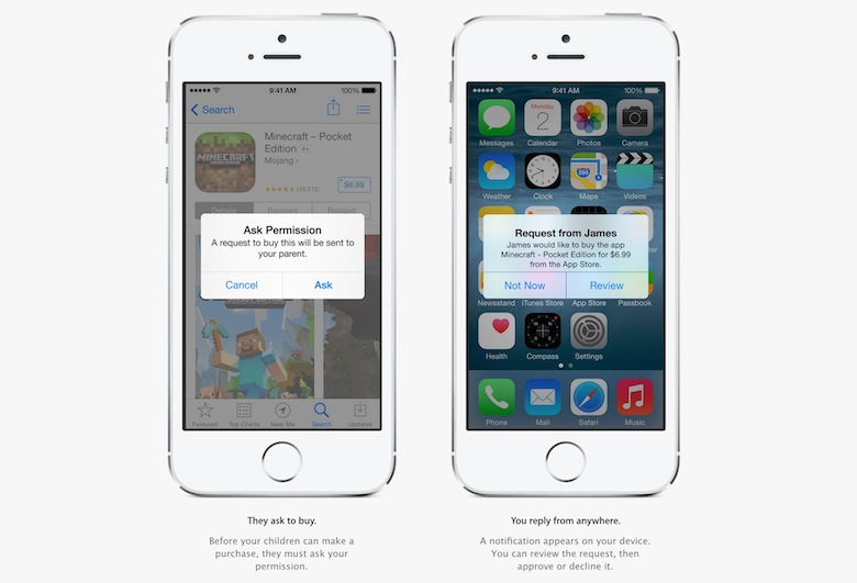
With iOS 8, Apple introduced a new and arguably long overdue feature for families: Family Share. In essence, users will be able to link all their iTunes accounts to a single family account. Sharing the same credit card information across all these accounts, all users in a family will be able to share purchases from iTunes, App Store, and iBooks.
The family organizer can approve or deny new purchase requests and can control which users are in the shared account.
As I explained earlier today, Android has the unique advantage of having the ability to login to multiple Google accounts at the same time, meaning you can have more than one account in Google Play. Theoretically, a family could all have personal Google accounts and one shared Google account, where everyone shares purchases. It would work, but I can see where it could become problematic. No one person – the owner of the credit card on the account, for instance – wouldn’t have control over what is and isn’t allowed for purchase. They could, of course, keep the password private, but they wouldn’t be able to approve purchases remotely.
Unlimited apps in folders
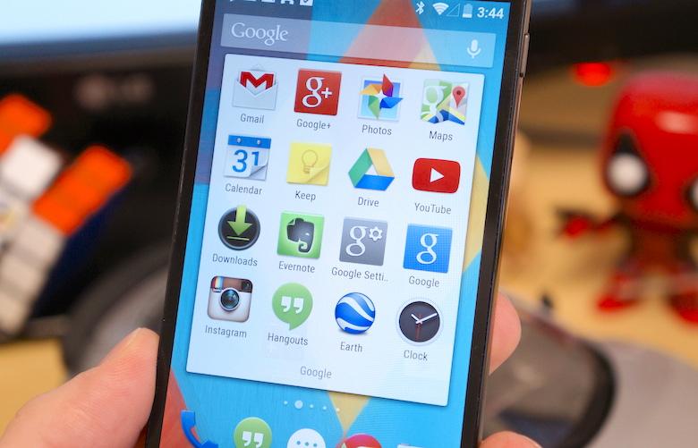
In iOS 7, Apple introduced a pretty significant UI refresh. Part of the update was changing the way home screen folders looked and operated. Apple removed the 16 app limit from before and left the amount of apps you can store in a single folder uncapped.
Android doesn’t have this luxury. In stock KitKat, users are limited to storing 16 applications in a single folder. While that may seem like more than enough, there have also been plenty of times I wanted to store more than 16 applications in a folder.
This may seem like a minor gripe, but allowing more applications in a folder with the ability to scroll would be a nice touch.
AirDrop
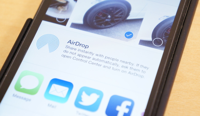
One of the most underrated features of Mac OS and iOS is AirDrop. It’s a stupid simple way to share photos between multiple iOS devices or Mac OS. In iOS 8 and Yosemite, Apple will be updating the file sharing service to be compatible across all its devices. Before, it only worked between two Macs or between two iOS devices. Come this fall, it will work between Macs and iOS devices, as well.
On Android, there are also some pretty simple ways to share small files between two devices, like Beam. However, Beam only works between two NFC-enabled devices (yes, including Windows Phone). You can also resort to third-party services like AirDroid or Wi-Fi File Transfer.
Still, no matter how many third-party options pop up, none of them seem to be as simple, reliable, or fool-proof as AirDrop.
Backup and restore
One of my least favorite things in this world is setting up a new phone. I used to love the process, but over one hundred times later, it’s a painstakingly awful process – particularly on Android.
On iOS, using either iTunes or iCloud backups, you can wipe your phone at any given time or upgrade to a new one, login to your account, and restore everything exactly as it was before. Of course, how efficient it is does take some of the fun out of rearranging your home screens and dull the sensation of having a new phone. Your home screen setup will look exactly like your last phone.
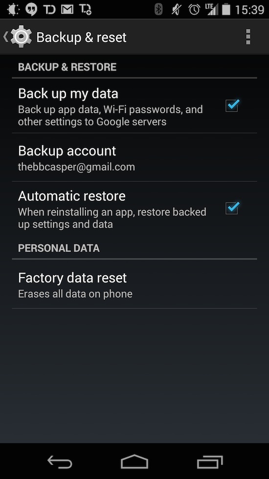 Still, it’s nice to have the option to restore literally everything to its previous state. And it’s also nice to have control over what you’re backing up.
On Android, you can select a Google account to backup to. But beyond that, there is no control overanything. You can’t control what is backed up. You can’t control when or how a restore happens. And, worst of all, if a restore doesn’t happen … too bad.
The biggest step in the right direction for Android is the ability to batch install apps from Google Play. And LastPass form fill is a godsend.
But the major difference here is at least a couple hours of slaving over a phone each time. Restoring an iPhone requires logging into your iCloud account, approving a few things like location services and iCloud Keychain, and letting your phone restore itself over some time. Sit it down and walk away.
If your Android phone does restore itself, you have to login to all your apps and restore all the settings and preferences manually. If it doesn’t, you must go through your list of previously installed apps in Google Play (which is even worse if you use more than one Google account), batch install them all, then proceed with setting up your home screens, logging into everything, and restoring all your settings.
Back gesture
Only having one navigation button – the Home button – Apple has always had to focus on a unified Back operation in iOS. It’s always been a soft button in the upper left corner of the display. Any time you advance in an application, tapping the Back button will take you to the previous page. In iOS 7, this Back button was refreshed in appearance, but functions just the same.
The difference is, while the button still functions as a button, you can also swipe from the left edge of the display when the leftward arrow is present. Like a page in a book, this gesture will take you to the previous page.
Android, on the other hand, has a dedicated soft Back button in the navigation bar. Most of the time, it works just as you would expect it to. Press Back and it takes you to the previous task. However, sometimes Back does weird things or things you wouldn’t expect. For instance, from the Google Now launcher, if you’re in Google Now, the soft Back button does absolutely nothing. Or say you’re reading through your Twitter feed and click a link. This link will open in Chrome, maybe in a new tab or an old one, depending on the Twitter client. Sometimes pressing back will take you to the previous Web page in Chrome, rather than back to the Twitter client. Pressing Back again might close Chrome and take you to the Home screen.
A lot of the consistency of how Back in implemented hinges on the developers and how they implement certain functions, meaning it isn’t entirely Google’s fault all the time. But I definitely wish there were a more consistent use of the Back button in Android.
What say you, ladies and gents? What do you feel Android L could take from iOS 8? What about the other way around? Are there any Android L features you’d like to see in iOS 8? Sound off below!

No comments:
Post a Comment