Following the WWDC keynote on Monday, some of us weren’t exactly sure how to feel about the new iOS 8 update. Unlike last year, which was a huge visual overhaul, iOS 8 is more background and feature upgrades which make the update seem more incremental than it actually is.
Behind the scenes, there’s a lot of new stuff going on – a lot of stuff we never thought we’d see Apple ever announce. For one, it introduced third-party keyboards in iOS 8, placing a larger part of the user experience in the hands of third-party developers. Third-party sharing, something I’ve been harping on for years now, is something that will come to iOS 8, once developers make use of Apple’s Extensibility APIs. A lot of the features aresurprisingly useful.
It truly shows after you get some hands-on time with the software. If you want to see some of them in action, check out our iOS 8 hands-on video from yesterday.
Still, not everything is perfect, iOS still isn’t what we would consider the most advanced operating system, despite Apple’s claims.
As such, here are five reasons you shouldn’t get excited over iOS 8.
One of the coolest features only works when charging
Siri, Apple’s digital assistant, was given a few more tricks this time around. For one, it can identify songs using Shazam. Simply long press the Home button to open Siri and it begins listening for music. Or, if you want to manually start identifying a song, just ask Siri, “What song is this?”
Siri now shows real time dictation, too, instead of waiting for you to finish your question before displaying it.
The biggest new feature, however, is the hands-free function. Say “Hey, Siri” and your iPhone or iPad will wake from a sleep state and Siri will begin listening. Cool, huh? Well, there’s a catch. It only works when your iOS device is charging. If you say “Hey, Siri” while on battery power, nothing will happen.
This is meant to be a hands-free function, primarily for in-car or while your phone is charging at your desk. And while not having to reach for your phone or unplug it is useful, it’d be more useful if the feature worked all the time.
It makes sense why it doesn’t however. An always-listening microphone would quickly drain your battery without the proper hardware. Here’s to hoping the iPhone 6 comes with a low-power core which could power the hands-free function at any time, charging or not.
Still no automated, smart assistant
While we’re on the topic of Siri, it’s important to note she isn’t fully intelligent just yet. She may have a few more tricks to show off, and as useful as those may be, Siri isn’t smart enough to work in the background or learn important things about you.
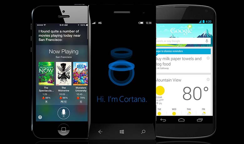
Like with Google Now or Cortana, both of which can give you travel time estimates to various places or to meetings, you can access a similar function in the Today view of Notification Center. But Siri does not provide a list of information cards which intelligently update in the background.
Rather, if you want anything from Siri, you have to call upon her, whereas with Google Now or Cortana constantly provide you with info, automatically.
Less Google, more Bing
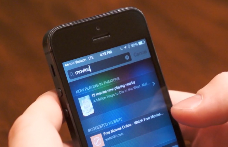
Spotlight has also been graciously updated in iOS 8. When you search certain terms, you will receive information cards from various sources, like IMDb entries or Wikipedia articles. You can find nearby locations, such as restaurants or coffee shops. These features are very helpful, especially when you don’t want to speak to Siri or when text entry is more appropriate. And best of all, these are powered by services other than Google, Yahoo, or Microsoft’s Bing.
However, like last year with Siri, Apple has chosen to replace Google with Bing as the search engine behind the Web searches. If you click the Search the Web button, it takes you to Bing instead of Google.
For many, this may not affect usage at all. As a personal preference, I would at least like to be able to choose my search engine of choice. Unlike with Safari, there is no option to change the default search engine, and that’s unfortunate.
Same boring home screen
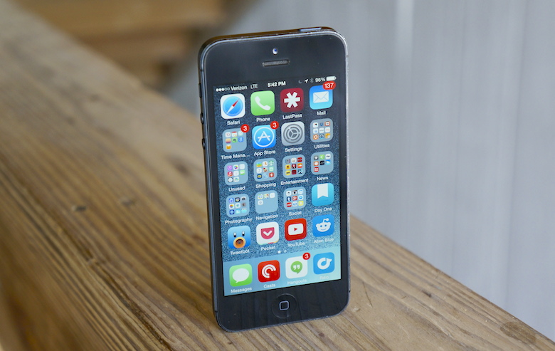
Visually, iOS 7 and iOS 8 are practically identical. Sure, there are little differences here and there, but they look the same at the surface. The lock screen is the same, Notification Center has the same basic appearance, Control Center is unchanged, and the Settings app is the same ol’ app it’s always been.
This also means the home screen hasn’t changed one bit. It’s still a grid of icons which can only be rearranged and tossed into folders.
Apple did announce widgets at the WWDC keynote, and those will begin appearing shortly for those with the beta. But Apple’s widgets differ from the widgets we know and love on Android. They don’t have a place on your home screen, but instead will be located in the Today view of Notification Center.
That’s fine by me, honestly. But I would much rather see a notable, useful change to the home screen, like the ability to rearrange icons however you want, not just the left-to-right, top-to-bottom alignment.
Multitasking still sucks
Finally, multitasking has not changed at all. It’s more of a hardware restriction than anything else, since the 1GB RAM can be problematic while only performing a single task, but iOS does not have true multitasking. Instead, it has a disjointed method of task switching. It works, but there’s nothing fancy about it.
Particularly with the size of the iPad, I would love to see true simultasking on iOS – a la Multi-Window in TouchWiz. The displays on iPads are too big to be limited to just one task at a time.
This is literally the biggest thing keeping me from adoring my iPad mini, especially now that it has (support for) third-party keyboards, third-party sharing, and Control Center.


No comments:
Post a Comment